Sunday 28 December 2014

The Shining film review

The Shining movie review
Film title: The Shining
Year of production: 1980
Director: Stanley Kubrick
Genre: Psychological horror
Brief plot outline
Jack Torrance, an author, takes on the job as an off-season caretaker at the foreboding Overlook Hotel and moves in with his wife, Wendy, and son, Danny who has mysterious hallucinations and an imaginary friend. During the 5 months they are there, Jack’s mental condition deteriorates and influenced by supernatural visions he descends into madness and tries to murder his wife and son.


Which two scenes impress you the most and why?
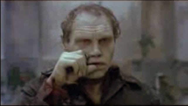
The first scene that impressed me was the iconic “Here’s Johnny” scene where a mad Jack Torrance has cornered his wife in a bathroom and after he chops a hole in the door he shouts “HEREEE’SS JOHNNY”. Looking at the historical context of this phrase, it was first used by Ed McMahon in ‘The Tonight Show Starring Johnny Carson’ a popular show in America and has connotations of comedy and entertainment attached to it. When Torrance uses it, it has connotations of fear and evil, but if we take into account the comedy connotation, it represents that Torrance is enjoying the madness and sees it as comedic and entertaining. The scene is also edited to be a quick paced montage, and quickly cuts between shots of Jack cutting the door and Wendy screaming. The music in the scene is parallel and has haunting connotations that put the audience on edge and make them fear Jack and his menacing actions. Looking at the cinematography of the scene, the close up of Jack’s face creates connotations of panic and fear for the audience and represents that he’s a mad and unstoppable force.
The second scene that impressed me was Danny’s hallucination of the Grady twins’ murder which primarily uses the editing technique of collision cutting between a shot of the girls standing still and laying dead on the floor. This cut makes use of the Kuleshov effect as it switches between a peaceful and calm shot of the Grady girls, to a horrible one of their death, extreme body horror and an axe which leaves the audience to put the two shots together to form a restricted narration. The girls are also symmetrically composed centre frame, when using the rule of thirds, to make them the main focus of the shot. This symmetrical composure is also seen throughout the film, often with corridors and shots of the carpet to make the hotel have connotations of nightmares and imprisonment with claustrophobic corridors adding to the confusing maze like representation of the Overlook Hotel.


How has watching the film helped me understand this genre?
This film was conventional to the horror genre and used many of the conventions across characters, mise-en-scene, cinematography, sound and editing. For the character conventions, Jack Torrance fulfils the roll of the psycho serial killer, whilst Wendy takes the role of final girl as she escapes the Overlook Hotel with Danny. For mise-en-scene there’s body horror when Haldermann gets hit by the axe and the hotel also features as a creepy location. Some of the cinematography techniques used include a point of view shot when the door to room 237 is opened and use of the new piece of equipment, a Steadicam. This is notably used for tracking shots of Danny when he cycles around the Overlook hotel. The film also uses primarily parallel sound to reinforce the creepy connotations of the hotel. The film also covers ideologies like sexism towards women, with Jack’s sadistic nature towards Wendy and has an open ending by showing Jack in the photo taken in 1922 before the events of the film take place to connote a sense of mystery and suspense leaving the audience to theorize about what it all means.


Which aspects of the film would you like to include in your own trailer?
I’d like to include the same volume of violence and body horror using examples like Haldermann’s death to inspire the planned death scenes we want to make in our trailer. Other aspects of the film I want to include is a deep story that’s brimming with suspense and supernatural threat and a claustrophobic chase scene between the psycho killer and a victim. All of these are conventional to the action and psychological horror genre which I would also try to represent in my trailer.


Which aspects of the film would you like to avoid in your own trailer?
Aspects of the film I’d like to avoid in my trailer include the long build-up of the first 2 acts as trailers need to be fast paced in order to attract the audience’s attention and the slow pace would not attract target audience members. One scene from the film that felt too drawn out was the tour of the hotel that dominated the majority of the first act of the film.


What was the best aspect/more enjoyable moment in the film and can it be recreated in your film?
For me, the most enjoyable aspect of the film was the slow mental disintegration of Torrance and the way the theme of isolation, paranoia and anxiety combined to make him hallucinate, which could be recreated in my trailer as the Priest starts to hallucinate due to the isolation, paranoia and anxiety he feels at the church.

Favourite horror scene analysis


My favourite scene from a horror film is the iconic "Chestburster scene" from Ridley Scott's 'Alien' (1979).

This scene features many horror genre conventions like, in mise-en-scene, there's the use of body horror when the Chestburster, a quick and smart monster, also known as "the perfect organism", emerges and the blood goes flying to splatter the characters surrounding Kane. It also uses fill high key, motivated lighting to connote that the Nostromo spaceship is functionally operational and that the characters are just entering the stage of disruption according to Todorov's Theory of Narrative. After this scene in the film the lighting becomes more low key to represent the danger the characters are in the recognition and reslove stages of Todorov's theory.

The cinematography of this scene also features several close ups of the Chestburster emerging from Kane's chest to connote bloody gore and to represent to the audience how dangerous and disgusting the aliens are. It also gives the audience queasy and uncomfortable connotations as nobody knows what the creature is yet it killed a character by violently bursting through his chest. The scene also features handheld shaky cam to connote panic and fear which again feeds into the idea of making the audience feel uncomfortable and queasy of the unknown.

The editing of this scene varies using a slow paced montage to connote tension and horror to the build up of the Chestburster bursting out, a quick paced montage to connote panic and fear when the first blood splatter appears before cutting quickly to the characters faces to show the scared connotations on their faces. The blood splatter also represents the collision cutting in this scene from a slow to quick paced montage. 

The sound in the scene is parallel and the dialogue is also diagetic, which fits in with the mood of the scene to further connote fear and tension for the audience. 

The special effects in this scene were all practical and they used a combination of animal blood, latex a dummy model and a fake chest to push the dummy Chestburster through. In the behind the scenes documentary below, the cast and crew discuss the Chestburster effect (from 1:17:00- 1:26:00).


Alien also has themes that challenge the cultural dominant ideology, notably the ideology of male rape fear. Ximena Gallardo C. and C. Jason Smith compare the facehugger's attack on Kane to a 'male rape and the chestburster scene to connote violent birth, noting that the Alien's phallic shaped head and method of killing the crew members add to the sexual imagery'. Dan O'Bannon, head writer, argues that the scene is a 'metaphor for the male fear of penetration, and that the "oral invasion" of Kane by the facehugger represents "payback" for the many horror films in which sexually vulnerable women are attacked by male monsters'. O'Bannon states he 'attacks them [the audience] sexually. And I'm not going to go after the women... I'm going to attack the men. I am going to put in every image I can think of to make the men in the audience cross their legs. Homosexual oral rape, birth. The thing lays its eggs down your throat, the whole number'. This film is outside the cultural dominant ideology to the extent where it represents a male's fear of rape which is never seen in film as they focus on the female victim character as, Propp used in his 1928 book "The Morphology of the folk tale", to represent a fear of rape.
(Source http://en.wikipedia.org/wiki/Alien_%28film%29#Analysis). 

Above; the Alien's phallic head which reinforces the connotation of sexual penetration.

Looking at the Industrial context of the time, there was no Hays Code and no other form of limitation were present as attitudes had become more relaxed due to the audience becoming more desensitized to horror, This meant Scott didn't have to hold back on the body horror that would've limited Auteurs like Hitchcock during the 1960's and could show gruesome events to attract the target audience's attention.

After looking at this scene I'd like to make an action/psychological horror film that can represent body horror and also the historical context of the time to make the audience feel uncomfortable when they watch the film.

Friday 26 December 2014

The Pusher Trilogy trailer review

Name of film- The Pusher Trilogy
Genre- Horror
Year released-2005
Your mark after viewing- 8/10


What happened in the trailer?
The trailer showed highlights from the 3 different The Pusher films, representing the various activities of the drug syndicate; including crime, body horror, drugs and sex. The trailer had intertitle reviews that link the 3 films together and establish to the audience critical acclaim that the trilogy has received.

What positive, clever or interesting aspects do you think you could include in your own trailer? What generic features are well fulfilled?
The trailer was clever in the respect that it was able to show highlights that represent the entire trilogy all at once that’ll also attract the target audience. The trailer is quickly paced and features mostly quick paced montages to keep the audience’s attention and so that the entire trilogy can be shown in the trailer. Linking to this, the heartbeat sounding music was fast paced too to give connotations of adrenaline and tension. The editing features match on rhythm cuts where the shot cuts in time with the music to build connotations of tension and excitement for the audience. The intertitles are reviews which show the critical acclaim and praise for the film and give the audience a representation of how good these films are to build excitement. The trailer also works well as it doesn’t give too much of the narrative away and keeps some suspense and mystery for the full film.


Which aspects of the trailer did you think were unsuccessful and would put off its target audience? How is it disappointing?
The text on the intertitles was too long and only just readable for the time it was on the screen meaning that the audience member could miss some of the text and have to pause the trailer several times, ruining its pacing. Despite the fact it withholds the narrative, it doesn’t give enough of the story to understand what is actually happening and could result in confusion. The trailer, due to trying to fit 3 films in, is too fast paced and some scenes can look like a blur as you can’t see what is happening in the scene.


What was the trailers average class score? Why did it receive that mark?
The average class score was 8/10 as the trailer doesn’t hold back on the body horror, crime, drugs and sex. This means the main aspects of the film are represented well and allows the audience to understand what the films are about.

Day of the Dead trailer review

Name of the film- Day of the Dead
Year released- 1985
Film genre- Horror
Your mark after viewing- 6/10

What happened in the trailer?
The trailer showed highlights from the film as well as showing a shot from inside a cinema and having target audience members react to the trailer. The voiceover helps to progress the narrative a little and establish that humans are dying out and zombies have taken over. As the trailer progresses we see a zombie sitting in the cinema eating popcorn and people start to look at him. The trailer ends after a few more highlighted with the zombie sitting alone in the cinema and contrapuntal music, “The Gonk” by The Goblins, plays which allows audience members to link it to the rest of Romero’s “Dead” series.

What positive, clever or interesting aspects do you think you could include in your own trailer? What generic features are fulfilled well?
The trailer showed highlights taken at different points from the film in order to show how the film would progress and address the narrative of the film. The narrative of the film is also established well in the trailer as the idea of zombies being experimented on to find a cure is expressed in the voiceover. The highlights are taken from different points of the film and therefore give it a wider representation as different aspects of the film are shown. The zombie in the cinema also had good makeup and could easily be distinguished as a zombie from the crowd of the people.

What aspects of the trailer did you think were unsuccessful and would put off its target audience? How is it disappointing?
The trailer also has a lot of features that are unsuccessful and off putting for a target audience. For example the entire scene of the cinema, whilst interesting, is annoying and unnecessary as it pulls away from the main highlights of the film by cutting between shots from the film and shots from the cinema. The trailer is also boring and monotonous as there is no form of collision cutting or fast paced montage, and only a slow paced montage is used throughout the trailer. The trailer also lacks body horror and action that should be engrossing the audience, but instead they focus solely on and drag out the description of the narrative of the film.


What was the trailer’s average score from the class? Why did it receive the mark it got?
The trailer got an average of 4.5/10 from the class due to the fact it was slowly paced with no collision cutting and featured an annoying voiceover. It also held back on the body horror and instead gave us connotations of comedy with the zombie in the cinema which contrasted with the film highlights that were being shown.

30 Days of Night trailer review

Name of film- 30 Days of Night
Genre- Horror
Year released-2009
Your mark after viewing- 8/10

What happened in the trailer?
The trailer starts when a woman is pulled out a window by a vampire and killed. More deaths follow and the intertitles address help progress the narrative by telling us that vampires are attacking an Alaskan town as night lasts 30 days there.

What positive, clever or interesting aspects do you think you could include in your own trailer? What generic features are well fulfilled?
The trailer featured an unconventional convention where a jump scare, which usually appears at the end, appears at the beginning of the trailer to give a cunning connotation and represent that the film is surprising and unexpected. The trailer also uses collision cutting between the vampire action and slower paced monologue scenes which gives the trailer an exciting pace. The body horror was well represented in the trailer and the vampire threat isn’t too established as well meaning the audience don’t really know what the full extent of the threat is. The intertitles also don’t give too much of the narrative away but still sell the idea to the audience. The background colour, and low key lighting, for these intertitles and the trailer was a gloomy blue to represent the cold atmosphere but as the trailer progresses this intertitles background changes to red to connote that blood will be spilt.


Which aspects of the trailer did you think were unsuccessful and would put off its target audience? How is it disappointing?
The trailer did have a few flaws however, namely that no characters were introduced so the audience aren’t able to connect with the characters and learn about their role in the narrative. The trailer was also very long and could lose the attention of some members of the audience. It also featured too many editing fades where the screen dipped to black. This is annoying for the audience as it ruins the quick pacing of the trailer.


What was the trailers average class score? Why did it receive that mark?
The average class score was 8/10 due to the fact it highlighted the action horror conventions as well as showing the body horror aspects that attract the horror target audience. The trailer used intertitles very well to address the narrative and it also featured a jump scare at the beginning and end of the trailer to throw you straight into action and keep you immersed in the action the trailer has to offer.

Thursday 11 December 2014

Dawn of the Dead (2004) analysis- Monica and the chainsaw

In this scene Monica, the blonde female in the group, is carved up by Glen when he loses control of the chainsaw, a phallic weapon which also reinforces her character archetype. Monica follows genre convention to be the ‘female victim’ as throughout the film she drinks, smokes and has sex with Steve which all represent her to be impure. This archetype is always given this impure representation giving the horror genre an ideology that if you drink, smoke and have sex, which is going against the “innocent” norm, you’ll die. The female characters that follow the genre convention of being “good” is called the final girl, as coined by Carol Clover, and often survives plus is hardened by their experience to give them more masculine conventions.

Snyder uses a medium shot here to make you focus on the action on screen and show a little of the low key background so your eye is drawn to the much more brightly lit character in the foreground. This film also uses a mixture of practical and computer effects to create body horror but in this scene computer effects are predominantly used so we can see the chainsaw slice through Monica. This is completely different to the original Dawn of the Dead which has the practical effects of Tom Savini. The digital effects blend in to give a more modern feel to this version of Dawn of the Dead.

Looking at the institutional context of the film, we can see that censorship has become more lax since the days of ‘Psycho’ and the original ‘Dawn of the Dead’ meaning scenes like Monica’s death are allowed to be shown on screen. There’s no more Hays Code of other strict policy towards violence as audience members have become tougher and are able to handle the high levels of horror. The only form of censorship in the UK now is the British Board of Film Classification (BBFC) which only censors a film if it contains intense violence against women and/or hardcore sex. One such film from the horror genre that was recently censored was A Serbian Film due to its representations of body horror and sexual content.

Dawn of the Dead (2004) analysis- Michael attacking zombies

In this scene a group of extra survivors enter the mall and the original group of survivors act to defend them from zombies so they can make it into the mall. The audience see Michael stand his ground against the zombies and he fulfils the male hero character convention in doing so. Referring to the historical context, he also fulfils the representation of the 1990’s/2000’s “new man” which is a mixture of showing emotion and caring (shown through his tender relationship with Ana) contrasted with moments like this where he mercilessly kills zombies. Michael is also outside the cultural dominant ideology as he’s divorced with 4 children, which is similar to Sam from Psycho who was also divorced and represents a subcultural group seen less often in mainstream, non-horror films.

Using Andrew Sarris’ Auteur Theory we can see how Dawn of the Dead matches Zack Snyder's auteur style as he heavily uses slow motion to lengthen the impact of bullets and matches them with parallel dramatic stings to connote warning and build tension in the character's actions. Another Zack Snyder film where he uses slow motion effectively is throughout Watchmen in scenes like when ‘The Comedian’ is pushed through a window.

Using Thomas Schatz’s genre theory we can see how this scene links into the action and horror genre as it uses conventions such as fast moving monsters in the form of zombies, body horror, a male hero and is edited to a fast paced montage. These are reoccurring throughout Dawn of the Dead and perfectly match the conventions of the action horror genre, also seen in the zombie attack scenes from 28 Days Later directed by Danny Boyle. 

Dawn of the Dead (2004) analysis- Opening credits reporter


This scene takes place during the opening credit montage where the audience see the zombies first take over. The opening credits is edited to be a slow paced montage with shots of an interview with the President of America, Muslims praying and body horror being mixed in with intertitles. At this point the parallel music, Johnny Cash’s “When the Man Comes Around” starts to play and the montage becomes quick paced, with shots of riots, medical procedures, blood, live satellite feeds and death. This quick paced montage builds up excitement and panic in the audience and make them scared of what they’re about to watch.

A wide shot is used here so you can see the background of a Middle Eastern city setting with mosque composed on the left hand side of the frame, if we use the rule of thirds. This composition gives it connotations of being evil and bad, as it looms over the reporter. This also links with the historical context of the time where America was still recovering from the 9/11 terrorist attacks and had a fear of terrorism spreading like a disease, which is represented through the use of zombies in the film and how they overrun America.

Using Todorov’s theory of narrative on this scene we can see it takes place at the disruption scene near the beginning of the Classical Hollywood Narrative. Continuing on from Ana's attack in the previous scene, here we are clearly told the zombie virus has broken out and is starting to infect the world. The world and Ana's equilibrium has been broken so the protagonist Ana must try to seek safety and a new equilibrium in the rest of the narrative.

Wednesday 10 December 2014

Dawn of the Dead (1979) analysis- zombies retake the mall


This scene from Dawn of the Dead (DOTD 1979) occurs at the end of the film when the zombies retake and stumble through the mall from the survivors as they are let in by the bikers.  A wide shot is used here to show the entire mall and connote that the zombies walking round are similar to normal people walking round and exploring the mall. The zombies reflect our ‘pure motorised instinct’, as quoted from the film, and even though they’re dead they’re walking around the mall it could be compared to people having a “pure motorised instinct” for the desire to buy and represent our consumerist nature. This can be especially true when applying historical context with events such as Black Friday that draw in huge crowds of people to buy goods at cheaper prices.
The mall also has bright and motivated lighting to give the mall connotations of friendliness and attract people to shop there. The left hand third of the frame is lit more brightly which represents that Romero is showing consumerism to be evil and tempting as the right hand third of the frame has more low key lighting. The centre frame shows the clock, and at the top, the red clock face. Red is used in films to connote danger and in this sense represents that time has run out and the zombies have retaken the mall from the survivors.
Bazin’s theory of “The Genius of the System” states that a film’s success is down to a combination of factors. Applying it to Dawn of the Dead we can see that as it’s a horror that features body horror, has a successful auteur, George A. Romero and the fact that it was relevant to the historical context of the time it was able to be a commercial success and gain $55,000,000 Worldwide from a (reputed) small budget of $650,000.

Romero challenges the norm and puts across his own sardonic representation of the world at a time of general depression in the USA, where it was recovering from the Vietnam War and Watergate.  Romero aimed to represent how consumerism and new shopping malls were being used as escapism from this at the time of the historical context and highlights how it can make us “zombies. “This can be shown by Stephen’s ‘It’s ours, we took it’ line as the bikers invade representing that he’s become addicted with consumerism, resulting in him losing his life in the process. Contrapuntal “Musak”, by the Goblins, reinforces Romero’s representation of consumerism to be ultimately ridiculous. 

Dawn of the Dead (1979) analysis- "Flyboy" can't shoot straight


This scene from Dawn of the Dead (DOTD 1979) follows the characters as they land the helicopter to refuel and defend each other as a small number of zombies try to attack. Stephen, or “Flyboy”, tries to kill a zombie attacking Peter but is shoved aside by Roger. This is because he can’t aim straight with his phallic weapon gun which connotes his lack of masculinity and bravery in the situation. This ideology also carries on in the rest of the film as Stephen is represented to be weak, clumsy and cowardly. This goes against the stereotypical character roles as Stephen should be the male hero as he was established to be quite good looking and is dressed I clothing that would fulfil the role. However, the fact he goes against the stereotype shows how Romero, the Auteur (based on the theories of Andrew Sarris set out in his essay “Notes on the Auteur Theory in 1962”), goes against the norm of the horror genre and the cultural dominant ideology to portray Stephen as a weak male character.
In contrast to Stephen, there’s Roger who could be classed as a male hero.  He’s connoted to be strong, confident and good with a gun as he can shoot straight which represents his masculinity. However he also gets carried away with killing zombies in a sadistic way, which is outside the cultural dominant ideology, and therefore represents he can’t be the true male hero, if we apply Propp’s character archetypes established in “Morphology of the Folktale” (1928) as he doesn’t act within this archetypal framework.

Romero uses a wide shot here to show the empty and open background which connotes loneliness and isolation that is also outside of the cultural dominant ideology. The emptiness of the shot and isolation from society represent a sense of hopelessness and abandonment as if they’ve been left to die.

Dawn of the Dead (1979) analysis- Head explosion scene


This scene from Dawn of the Dead (DOTD 1979) sees a SWAT team clearing out an infected apartment complex of African-Americans, who are also heavily discriminated against by Wooley, a SWAT officer. The heavy racism was a link to the historical context of the time where racism was more prevalent and Romero sought to challenge this by representing how horrible racism is, with Wooley shooting uninfected African-Americans sadistically.
The special effects at the time where conducted by Tom Savini, a well-known special effect artist who used his experiences in the Vietnam War to inspire his effects and represent how horrible body horror is to the audience. Romero and Savini were also not held back by the Hays Code that had limited Psycho in the 1960’s. Looking at the institutional context of the time we can see it’s because target audience members were becoming harder to scare, due to real life experiences, and this resulted in horror films being able to use more body horror to shock the audience. The effect in this scene is an exploding head and represents how far the film industry could progress in little over a decade.
The lighting in this scene is motivated by the lamp on the right hand side of the frame and gives the apartment connotations of being bright and homely. It’s only one of three props in the mise-en-scene it also makes the apartment connote being basic and simple. The fact that the residents have a small amount of possessions represents they are not affected by consumerism as much, with the lack of items also connoting their tenement housing.

The scene features collision cutting with some slower cuts in the corridors between the quicker cuts of rooms filled with zombies. However as more zombies appear and overrun the SWAT team, the cutting gets becomes a quick paced montage to build connotations of tension, panic and adrenaline.

Tuesday 25 November 2014

Psycho analysis- Mother's reveal

This scene in Psycho comes near the end of the film and has Lila Crane, Marion’s sister, exploring the Bates Mansion. She stumbles into the cellar and discovers the corpse of Norma Bates; “Mother”. This is a close up shot with the corpse being composed in the centre of the shot denoting it’s the main focus of attention in the shot.
The smile on the corpse’s face is wide and shows the teeth to be bared in a grin. This connotes happiness and laughter which represents the fact that Mother is enjoying the events and murders that are happening, as when she was alive she was protective of Norman and didn’t want him near women. This part of her personality ideologically lives on in Norman’s head and makes him kill.
 The lighting in this scene is not only low key and motivated by a light bulb on the ceiling but is also a moving light source which casts huge moving shadows across the corpse’s face and the room. The shadows illuminate her face in different ways and almost animate the corpse so that it looks like it’s laughing and rocking back and forth which further reinforces the representation of the corpse enjoying the events taking place, especially as another women was about to be killed who interfered with Norman.
The corpse is a direct historical context to Ed Gein and inspired the actions of Norman and “Mother”. Ed Gein was a serial killer in the 1950’s who famously killed and raped women before cannibalising them. He kept his Mother’s corpse too and would perform necrophilia. This was due to the emotional link Gein had to his mother though an Oedipal Complex; which is loving your mother but hating your father. Gein was also schizophrenic and would use this emotional link to embody his mother and the ideals he was brought up with from her. This would also result in him killing other women if he became attracted to them as the “Mother” part of his brain forced him to not have sexual urges that would pose a threat to the relationship of Gein and herself.

Using Thomas Schatz’s “Genre Theory” we can see how this scene links into the horror genre. In this scene we not only see the old corpse of Norma Bates, but we also see the psycho killer, low key and motivated lighting, phallic weapon, final girl and male hero; all of which are conventions of the horror genre and present in Psycho.

Psycho analysis- Mother kills Arbogast

This scene from Psycho is the second, and last, murder of Arbogast, the private detective. It takes place in the Bates mansion and has Arbogast climbing the stairs slowly to then be greeted by “Mother” (Norman) and killed by falling down the stairs and being stabbed. This is a top down wide shot and is composed with Arbogast on the left of the frame and Mother on the right which can be seen with the rule of thirds grid. Stereotypically villains are portrayed on the left hand side of the frame but here Arbogast, who’s trying to find Marion, is composed on the left. This connotes that Arbogast is being portrayed as a villain which in turn represents he’s intruding on Mother/Norman and as Norman can be seen as schizophrenic with a childish nature it would give an ideology that Norman sees Arbogast’s intervention as a threat and decides to act to defend himself.
At the time of Psycho’s production in 1960 Hitchcock was limited by the Hays Code as it stated that violence, blood, murder, sex and things outside the cultural dominant ideology were not allowed to be showed on film. He pushed the boundaries as far as he could by having Arbogast’s face slashed and a little blood come out, along with the fall backwards down the stairs. This was drastically changed in the 1998 remake of Psycho where Arbogast gets 3 slashes across his face and a more brutal death. This was because the institutional context had changed and body horror had become more relaxed.
The knife that kills Arbogast is a phallic weapon and asserts Mother's dominating power over Arbogast and implies a sexual perspective to Mother/Normans murders as he’s lonely. This can be linked to the historical context of Ed Gein, who Norman Bates is based from, and the fact that they were both dominated by a dead mother figure in a schizophrenic manner and would kill people as the ‘Mother’ commanded it in his head.
The scene features low key lighting and motivated lighting from the bedroom behind Norman/Mother and casts long shadows in multiple directions across the hall. This represents Norman’s split personality as the light only hits him and sends his shadows down the hall to where Norman’s room is. This connotes his childish and true nature and another being cast over Arbogast connoting his immediate death. Another shadow is also on the door frame of Mother’s room connoting that Mother and that room is an important part of Norman too.

Using Andrew Sarris’ theory of Auteur theory we can see how Psycho fits into Hitchcock’s Auteur style. As the “Master of Suspense” this scene and the film in general fits the thriller aspects of murder and intrigue and having slow paced editing contrasted with scenes of quick paced montages for the action in the film.

Psycho analysis- Norman Bates and the birds


This scene from Psycho is the first major dialogue between Norman and Marion, after she arrives and settles in at Bates Motel and takes place in Norman’s office behind the reception. Norman is composed on the right hand third of the frame in a low expressionist angle to connote his power and represent that he’s dominating over Marion, like how ‘Mother’ dominates Norman.
Present in the mise-en-scene behind Norman there are stuffed owls. These birds of prey represent Norman’s inner vicious nature and give the ideology that he’s an aggressive predator. Like Norman they're framed from a low expressionist angle, giving more menacing and fearful connotations. The owl is a predator, seemingly swooping in for the kill. This gives us the ideology that Norman is also tracking Marion “Crane,” prey for an owl and also prey for Norman.
The lighting in this shot is low key and motivated by the lamp to the bottom left of the frame and creates long shadows that appear long the frame. The most notable shadow belongs to the owl on the back wall and it reinforces the connotations given by its framing in the shot. The lighting also illuminates one half on Norman’s face giving him connotations of being half good and half bad. This also reinforces the ideology of Norman’s mental state being schizophrenic with one half being good and the other bad.
The scene also features parallel music that reflects the mood of the conversation. The conversation itself was about the idea of “personal traps” and links to how Marion ran away from her life to be with her lover Sam, a divorced man, which puts them outside of the cultural dominant ideology (CDI) as he’s divorced and she’s in love with him. As they’re outside the CDI it gives the conversation creepy and unsettling connotations for the context of the time.

Using Todorov’s Narrative Theory on this scene it takes place during the disruption period with Norman posing a threat to Marion as she came to Bates Motel and has to deal with Norman’s “Mother” alter ego.  Applying Propp’s character theory we can see that Norman takes on the “psycho killer” archetype and Marion takes on the Female Victim archetype with Norman having conventions like being quite shy and likeable and schizophrenic whilst Marion has conventions like being blonde, committing a crime (stealing money) and having sex with Sam at the start of the film.

Thursday 20 November 2014

Horror magazine cover analysis- Paracinema

The masthead of the magazine is portrayed in a big yellow font in the top third of the magazine in order to catch the eye and the attention of the target audience members. The yellow font is darker around the edges giving it connotations of grime, and when linked with the main image, connotations of eerie sickness as well. The title helps to reinforce the representation of Regan from The Exorcist along with making the magazine represent an eerie, supernatural horror.
The magazine has a yellow, brown and, white and black colour scheme and they help to signify different representations to the target audience. On the image of the girl her skin is a pale yellow and brown which connotes sickness, death and disease. This, combined with the wide, disturbing smile and wild sickly eyes this all comes together to give the girl a representation of a sick evil, and seeming as she’s from The Exorcist it fits into the ideology of the film that she is sick from an evil supernatural possession.
The white and yellow are also used for text and coverlines with the white font denoting a title and the yellow font denoting information about the article. They made the font stand out by making it big and boldly coloured so to attract the attention of the target audience.
The information for The Exorcist article reflects the angry and anarchical nature of the film’s villain by mentioning “shitty gender roles” and “pissed off daughters”.
“The woman’s issue” is an interesting coverline as it reflects women’s power in the horror genre.  “All articles written by women” connotes a degree of power and can be used to represent the female gender in the horror genre. The power women have in horror films comes from the “final girl” theory where the surviving character is an innocent girl and portrays an ideology where women are stronger than men as they survive.  The fact that “all articles [are] written by women” represents that females have extensive knowledge of horror films and are able to use this to inform the target audience. 

Horror magazine cover analysis- The A-Z Of Horror

The masthead of the magazine is in block red capitals and has splatters and dribbles running across the cover. These denotations all connote blood and the gory conventions shown in horror films. This means the blood red capitals represent horror, and more specifically slashers which can be linked to the appearance of iconic slasher villain’s, on the front cover. Blood is used on the cover to help amplify this genre convention making it a motif of the magazine.
The top of the magazine features a “free gifts” area which can act as a USP for the target audience to be attracted to, and thus attract more target audience members. The font is in block and bold capitals so that it attracts the audience’s attention and is also placed on a red background which fits into the magazine motif of blood representing horror.
The magazine cover follows a predominately brown, red, white, yellow and black colour scheme with the brown being used for the main image of iconic horror characters, and the red, white, black and yellow being used for coverlines, boxes and text in general.
The brown image has a sepia tone denotation which gives it connotations of old age, nostalgia and dirt making the iconic horror characters have representations of timeless iconography; as if they’ve been around since the beginning of the genre.
The main coverline continues the blood red splatter motif shown on the masthead as splatters of blood cover the title and help to reinforce the slasher genre conventions.
The title is in big, white and bold font which draws the eye of the audience. It also dominates the bottom third of the magazine cover enabling it to be easily seen by the target audience.
This magazine actually has a BBFC, British Board of Film Classification, age rating representing the fact that it’s aimed at an older target audience and is not intended for children.

Horror magazine cover analysis- Scream

The masthead of the magazine is inspired by the iconic horror film “Scream” and can also be based off of an audience convention of the horror film genre. The title font has denotations of being red and having drips giving it connotations of blood and gory horror which the target audience will look for in the magazine as it has also been established on the main strapline.
The main strapline shown here above the title reads “Blood, Guts, Gore & More” which gives a representation of what’ll be covered in the magazine due to the fact they’re all conventions of the horror genre and it’ll appeal to the target audience of horror movie fans.
The main coverline, “Hatchet Horror”, has denotations of being bold, white and a blood splattered look on the side of the hatchet. The blood splatter denotation stands out as you’d generically expect the font to be red and represent blood, however it’s white and has unnatural, unnerving and out of place connotations giving the font a supernatural, inhuman and unconventional representation which fits into the ideology of the genre that this film, Hatchet, comes from; slasher/ supernatural horror.
The image on the front cover follows a predominately white, blue and black colour scheme which gives the image connotations of being cold and grim and gives the image an empty and haunting representation.
This can also be linked to denotations of coldness, death and an unnatural or supernatural feeling, from the man, resulting in connotations of emptiness and a lack of emotion, especially from the eyes, giving the man representations of fear, heartlessness and brutality which are iconic genre conventions for a slasher villain.

Horror post analysis- Godzilla

The title of the film is in thick, red text to stand out and help connote fear along with the name of the film itself. The red gives connotations of fear, danger and evil, representing Godzilla to be the villain of the narrative. “Godzilla” can be broken down to “God” and “Zilla” giving it connotations of power, strength, fear and monstrosity.
Godzilla itself is Japan’s reaction to the nuclear bombs dropped on Japan at the end of WW2 by the Americans. Godzilla has connotations of horror, destruction, rage and power which in turn represents the idea of the bombings being horrible and destructive and keeps the ideology of nuclear weapons being powerful and bad in the wrong hands.
Using Todorov’s theory of Narrative we can see that with Godzilla destroying Japan and the people looking up scared, we are in stage 2 of the narrative; Disruption. Shown on all of the posters analysed stage 2, disruption, or stage 4, fixing the disruption, seem to be shown representing that the posters advertise the most intense moments of the film to draw in the target audience members.
If we apply Male Gaze theory we can see that the girl is fully clothed and takes a position in the arms of the male connoting she’s looking to him for protection.  We can also apply Final Girl theory to her as she’s the only girl shown on the poster, and she’s in a position to be defended it connotes that she is quite innocent and not “bad” by horror movie conventions representing she’s the “final girl”.
The main human actors are shown at the bottom of the poster looking up to him from a low angle, signifying fear and horror at Godzilla and giving him powerful connotations that help reinforce the ideology of Godzilla representing nuclear warfare and it’s horrifying consequences.

Horror poster analysis- Alien

The denotation of “Alien” connotes strange, mysterious and frightening representing that the “Alien” will be scary and inhuman, making it completely different to the humans in the crew. As the name connotes fear and aliens are stereotypical of the sci-fi genre this makes it belong to the Sci-fi-Horror sub-genre. Whilst it wasn't the first Sci-fi-Horror it broke the conventions of the sub-genre by not having many shots of the Alien at all.
The Alien egg is placed in the middle of the poster, so by dividing it up by the rule of thirds, we can see that it represents that it’s key to the narrative of the film. It also further reinforces the connotations from the films’ title as the egg has a green light emerging from it, stereotypically linked to aliens that also connote mystery. The egg also looks like a planet, connoting that whatever lives on the planet is alien, and with the green light, could represent that it’s also evil.
As the poster doesn't show any characters, especially the female ones, from the film, the “Male Gaze” and “Final Girl” theories can’t be applied which represents the fact that all the characters might die, including a strong female protagonist.
In terms of narrative, if we apply Todorov, we can see the narrative is at stage 2: Disruption. This is down to connotations of the cracked egg and “In space no-one can hear you scream” strapline suggesting that the egg results in screaming and a disruption in the equilibrium of the narrative.
The strapline of the film, “In space no-one can hear you scream”, connotes that the film is set in space, and can be reinforced by the black background, and that the film will make you screaming representing that the horror genre conventions will be significantly shown in the film.

Horror poster analysis- Shaun of the Dead

The genre of the film is established at the top of the poster in short sentences to connote the blunt, sarcastic comedic value of the film and also, as the “With Zombies” line is second it could connote they aren’t as important, representing that the zombies pose as a plot device and aren’t the main motivation behind the continuation of the narrative, instead of focusing on the love story narrative.
The denotations of the characters poses are strong, brave and determined, connoting that they are ready to face the zombie threat which can also be reinforced by the weapons they hold. Shaun is also holding a bunch of flowers representing that he’s try to save his relationship along with his life
If we apply Male Gaze theory, by Laura Mulvey, we can see that the girl, Liz, is fully clothed and takes a position behind the main character connoting she’s not there for male purpose. We can also apply Final Girl theory to her as she’s the only girl shown on the poster, she’s armed and not in a relationship and doesn't do anything “bad” representing that she’s the “final girl”.
If we apply Propp's theory of characters, the characters on the poster are the helper, hero, and princess going from left to right. The hero seeks to correct the disruption of the narrative, the helper helps the hero achieve his goal and the princess is awaiting rescue from the villain or threat. These character types are all shown in Shaun’s master plan to rescue Liz and go “The Winchester” pub.
The colour design of the poster shows the background of the main characters to be red, to show the outline of the zombies and connote blood and danger representing that the zombies are dangerous and a main threat to the heroes of the narrative.

The history of the horror genre- 1990-2000

The 1990's started with the continuation of many sub-genre's and ideological themes that had been present in the 1980's. Slashers were still in the mainstream for audiences and many iconic films from that time period, like A Nightmare on Elm Street, Friday the 13th and Halloween saw sequels throughout the decade but were mostly panned by critics and fans.


The 1990's also saw the emergence of a new horror sub-genre: Metafiction, with each film linking itself to the real world and the world of the narrative through the use of plot of subconsciously breaking the 4th wall by having the film tell the story of it's own production. Famous films in this new sub-genre include Wes Craven's New Nightmare (1994) and Candyman (1992).


However the horror genre had a number of problems at this time; namely that it'd had worn itself out with the endless number of sequels and similar films in the slasher genre during the 1980's, A Nightmare on Elm Street  having 4 sequels alone during the decade. The 1990's also saw that the target audience of horror films had grown up and weren't captivated by the low budget and tacky looking practical effects of body horror as they'd recently been exposed to the CGI of sci-fi and action films, like Terminator 2: Judgement Day (1991). However the horror genre adapted and soon started using it for films like Species (1995), Anaconda (1997) and House on the Haunted Hill (1999). 

The late 1990's also saw the introduction of a new sub-genre to try and attract audiences; the found-footage genre, with the first notable entry being The Blair Witch Project (1999). This genre 
really picked up in the 2000's with films like Paranormal Activity (2007) and even continues into the 2010's with films like Grave Encounters (2011).